new mod*k format icons? **POLL CLOSED**
BotB Academy Bug Reports and Feature Requests
 
 
202437
Level 29 XHBist
Tex


post #202437 :: 2024.12.02 12:45am :: edit 2025.01.04 11:45am
  
  NikoAnimation, goluigi, luna197, sean, Xaser, RevvoBolt, ItsDuv, lasersphaser, Lasertooth, nitrofurano, uart, Luigi64, damifortune, Webriprob, roz, Opilion, blockblockblock, mahogany, arceus413, Surfcroc and kleeder liēkd this
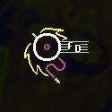
Maybe it's just me, but I stare at the mod*k format icons all lined up and they look almost identical to me. We're talking about a massive 8 format variants here, while we have significantly smaller format variants like adlib/opl2/opl3 and boom/doom that have different colors, which is enough to differentiate.

So, much like the aforementioned opl and mappist variants, what I propose here is that these 8 formats have different background colors.

(note that I'm only talking about their default look, so the unearned/bronze/silver/gold variants would still look the same)

If they looked more like the examples on the right, I'd feel more inclined to host them and badge hoard them. But the way they currently are, I'm like "meh..."

-----------------------

Poll closed: which do you prefer?


"rainbowed (darker)" wins. Thank you for your votes.

rainbowed (darker)
50% (12 votes)

rainbowed (brighter)
41,67% (10 votes)

keep them as they are
8,33% (2 votes)

https://strawpoll.com/BJnXV6x7XZv/results
 
 
202440
Level 32 Chipist
kleeder


post #202440 :: 2024.12.02 1:24am
  
  goluigi, dobra, Chepaki, sean, Xaser, ItsDuv, nitrofurano, retrokid104 and Surfcroc liēkd this
omgggg color gradient rainbow badges. I 100% approve this
 
 
202458
Level 29 Mixist
mirageofher


post #202458 :: 2024.12.02 4:25am
  
  sean liēkd this
hell yea. why not make them different shapes too? 12k 16k and 24k are very similar in colour and number lookalikeness, so i cld see some people (mainly myself, blind ahh goober) getting them confused
 
 
202459
Level 25 XHBist
roz


post #202459 :: 2024.12.02 5:13am
  
  gotoandplay and kleeder liēkd this
if it were up to me i'd paste those demo images into the spritesheet on the spot. great suggestion.
 
 
202461
Level 32 Chipist
kleeder


post #202461 :: 2024.12.02 5:16am
  
  goluigi, dobra, Xaser, SweatyNoodle, ItsDuv, Baron Knoxburry, Caffeinator, Luigi64 and mirageofher liēkd this
there's no spritesheet on botb. we only have a spriteshit
 
 
202489
Level 31 Chipist
damifortune


post #202489 :: 2024.12.02 8:28am :: edit 2024.12.02 8:29am
  
  ItsDuv and SRB2er liēkd this
please yes, great idea

the only thing to note is this *might* make it more awkward to add other tinymod formats in the future but that's no reason not to do it
 
 
202495
Level 22 Mixist
02FD


post #202495 :: 2024.12.02 8:43am
  
  dobra, sean and mirageofher liēkd this
I think shape wld be better in the long term bc Colorblind People (rip bozo)
 
 
202539
Level 25 XHBist
roz


post #202539 :: 2024.12.02 11:12am
  
  mirageofher hæitd this
  
  radian, arceus413, ItsDuv, Webriprob, kleeder and Opilion liēkd this
they're already differentiated by shape - the shape of the numbers.
 
 
202577
Level 22 Mixist
ItsDuv


post #202577 :: 2024.12.02 3:28pm
i agree with this so much
 
 
202583
Level 25 Grafxicist
Webriprob


post #202583 :: 2024.12.02 4:23pm
Color choices are on point too. 04 is totally a dark lavender and 64k is definitely fire red
 
 
202615
Level 29 Mixist
goluigi


post #202615 :: 2024.12.02 9:05pm
  
  Collidy, mirageofher, Xaser, ItsDuv, doopdee and kleeder liēkd this
mod*k looks like a f***ing sw**r w*rd
 
 
202617
Level 12 Pixelist
John Favourite


post #202617 :: 2024.12.02 9:07pm
  
  SRB2er liēkd this
d*n't sw**r!!!
 
 
202619
Level 29 Mixist
goluigi


post #202619 :: 2024.12.02 9:09pm :: edit 2024.12.02 9:10pm
  
  Xaser, ItsDuv, SRB2er, kleeder and damifortune liēkd this
@dami

mod02k → purple
mod01k → ultraviolet (need vision protection)

unless you wanted a mod13.8263k format
 
 
202632
Level 32 Chipist
kleeder


post #202632 :: 2024.12.02 10:03pm
  
  SRB2er, mahogany, blockblockblock, Collidy, mirageofher, ItsDuv and Lasertooth liēkd this
mod*k because it is illegal to say n*mbers on b**b
 
 
202635
Level 31 Chipist
damifortune


post #202635 :: 2024.12.02 10:30pm
  
  icrawfish, Collidy, sean, ItsDuv, pedipanol, Lasertooth, arceus413 and kleeder liēkd this
btw, you're right that the OPL2/3 icons set a cool precedent for this. in case anybody's curious, their colors are hue shifted equally in either direction from the old Adlib icon - that was jangler's idea!
 
 
202637
Level 27 Chipist
blower5


post #202637 :: 2024.12.02 10:51pm
  
  sean, ItsDuv and Jangler liēkd this
presumably the brown color the chip is on top of is an old brown PCB... PCBs of course come in every color imaginable now so this idea works skeuomorphically too - but this also suggests some specific colors: classic green pcb, old brown pcb, ancient red pcb, random hobbyist board that's purple for some reason. Overall I'd like the colors to be more realistic and less vibrant
 
 
202659
Level 28 Chipist
Jangler


post #202659 :: 2024.12.03 5:47am
  
  sean and blower5 liēkd this
@dami - hey i just complained that the proposed icon(s) should look more similar to the old adlib one! the hue shifting was all you

personally i think these icons are *supposed* to look nearly identical, since the formats themselves are identical apart from the filesize limit. but if we implement this, i agree w/ blower and would prefer less vibrant colors! the current proposal is a little too skittles for my taste
 
 
202770
Level 22 Mixist
02FD


post #202770 :: 2024.12.03 4:53pm :: edit 2024.12.03 4:54pm
oh actually true i forgot the numbers differentiate them visually
 
 
202845
Level 32 Chipist
kleeder


post #202845 :: 2024.12.04 4:08am
  
  ItsDuv and mahogany liēkd this
I never had an issue with the current icons.
I like that they are all the same.

BUT .... rainbow.
rainbow is epic
 
 
202847
Level 20 Chipist
Max Chaplin


post #202847 :: 2024.12.04 5:39am
  
  mahogany, ItsDuv and Lasertooth liēkd this
Could also make the text larger. Or just wider, to leave room for the chip.
 
 
203098
Level 29 Mixist
mirageofher


post #203098 :: 2024.12.06 12:52am
@roz i agree that numbers are generally different-looking, but on the page the font choice makes it very difficult to tell them apart.

source: guy who squints and zooms in every time they access the page

tldr all numbers on the modxk are rectangles so roz is wrong
 
 
207125
Level 29 XHBist
Tex


post #207125 :: 2025.01.03 4:20am
Better?


207126
Level 24 XHBist
Surfcroc


post #207126 :: 2025.01.03 4:36am :: edit 2025.01.03 4:38am
  
  goluigi liēkd this
Honestly, I like the bright colors in the original post more, but that's just a personal preference.

(Still an awesome idea that I would love to see implemented!)
 
 
207135
Level 29 XHBist
Tex


post #207135 :: 2025.01.03 6:36am
  
  ItsDuv, Surfcroc, arceus413 and big lumby liēkd this
Knowing this community, maybe this would work better as a poll.

Which would you prefer?


Here's the poll. It'll run for 24 hours:

https://strawpoll.com/PKgleVANoZp
 
 
207136
Level 25 Chipist
arceus413


post #207136 :: 2025.01.03 6:44am
i can't vote with a vpn but i would've picked darker :D
 
 
207143
Level 31 Chipist
damifortune


post #207143 :: 2025.01.03 9:27am
  
  Jangler liēkd this
imo if we're making a poll, there should also be a third preference for the original icons - i do actually like these but it would be useful information
 
 
207146
Level 29 XHBist
Tex


post #207146 :: 2025.01.03 9:52am
I was actually thinking the same thing, initially. But I couldn't think of a third alternative that was different enough to justify its inclusion.
 
 
207147
Level 32 Chipist
kleeder


post #207147 :: 2025.01.03 10:05am
  
  Jangler and damifortune liēkd this
damis idea was that the 3rd option wld be "keep them as they are"
 
 
207174
Level 29 XHBist
Tex


post #207174 :: 2025.01.03 11:39am
  
  Surfcroc and damifortune liēkd this
Oh, I misread.

New poll, then: which do you prefer?


Here's the second poll. Again, it'll run for 24 hours:

https://strawpoll.com/BJnXV6x7XZv
 
 
207177
Level 21 Grafxicist
Ahornberg


post #207177 :: 2025.01.03 11:55am
  
  SRB2er liēkd this
mod*k over the rainbow
 
 
207270
Level 29 XHBist
Tex


post #207270 :: 2025.01.04 8:35am :: edit 2025.01.04 11:47am
EDIT: "rainbowed (darker)" wins. Thank you for your votes.

rainbowed (darker)
50% (12 votes)

rainbowed (brighter)
41,67% (10 votes)

keep them as they are
8,33% (2 votes)

https://strawpoll.com/BJnXV6x7XZv/results


LOGIN or REGISTER to add your own comments!